 Buy now
Carousel (Slider)
A slideshow component for cycling through elements (images or slides with any content) like a carousel.
Make sure to link to Tiny Slider css and js files in your document: vendor/tiny-slider/dist/tiny-slider.css and vendor/tiny-slider/dist/min/tiny-slider.js. Use this page as a reference.
You can alter carousel look and behaviour via modifier CSS classes and flexible data API.
Basic HTML structure:
<div class="tns-carousel-wrapper tns-nav-enabled">
  <div class="tns-carousel-inner" data-carousel-options='{}'>
    <!-- Carousel slides here -->
  </div>
</div>
Modifier classes:
tns-controls-static- Controls (prev/next buttons) are always visible.tns-controls-outside- Always place controls (prev/next buttons) outside of carousel content.tns-controls-outside-sm/-md/-lg/-xl/-xxl- Responsive placement. Controls (prev/next buttons) are placed outside of carousel content on sm/md/lg/xl/xxl screen size and up.tns-nav-outside- Position nav (dots) outside of the carousel content.tns-nav-outside-flush- Removes top/bottom spacing from nav (dots) outside of the carousel content.tns-carousel-light- Switch controls (prev/next buttons) and nav (dots) skin to light version.
Data API:
data-carousel-options = '{}':
"mode": "carousel" | "gallery"- With carousel everything slides to the side, while gallery uses fade animations and changes all slides at once."axis": "horizontal" | "vertical"- The axis of the slider."items": 1- How many items to display"nav": true/false- Enable/disable dots control"controls": true/false- Enable/disable prev / next arrow buttons"loop": true/false- Enable/disable infinite loop"speed": 300- Speed of the slide animation (in "ms")"autoplay": true/false- Toggles the automatic change of slides"autoplayTimeout": 5000- Timeou between transition. Value in ms | 1000ms = 1s"gutter": 0- Space between carousel items (in px)"autoHeight": true/false- Height of slider container changes according to each slide's height."navAsThumbnails": true/false- Indicate if the nav (dots) are thumbnails. Set to true if you want to replace dots with thumbnails."navContainer": string- The container element/selector around the dots.navContainermust have at least same number of children as the slides. Use this option to link your carousel to thumbnailstns-thumbnails"controlsContainer": string- The container element/selector around the prev/next buttons.controlsContainermust have at least 2 child elements. Use this option to link your carousel to external controlstns-carousel-controls"responsive": {"0": {"items": 1}, "768": {"items": 2}, ...}- How many items to display on each screen size. Options are not limited to number of items. You can change any option based on screen size.- For more options please visithttps://github.com/ganlanyuan/tiny-slider#options
Controls on hover + Nav (dost) inside

<!-- Controls on hover + Nav (dost) inside (Defaults) -->
<div class="tns-carousel-wrapper">
<div class="tns-carousel-inner" data-carousel-options='{"gutter": 16}'>
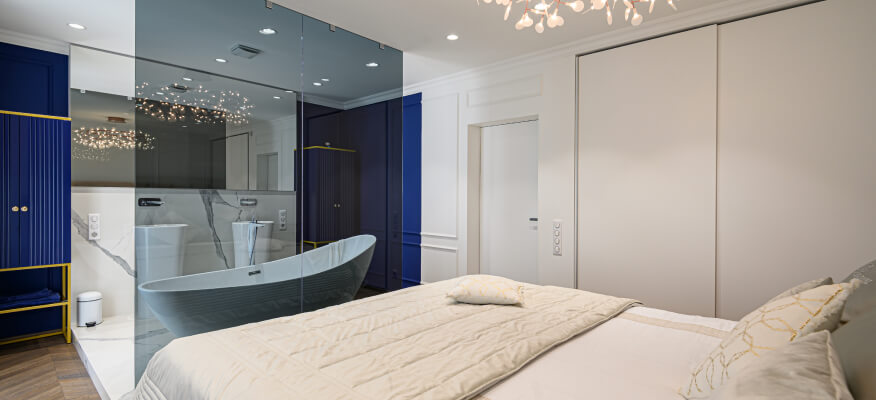
<img src="path-to-image" alt="Image">
<img src="path-to-image" alt="Image">
<img src="path-to-image" alt="Image">
</div>
</div>// Controls on hover + Nav (dost) inside (Defaults)
.tns-carousel-wrapper
.tns-carousel-inner(data-carousel-options='{"gutter": 16}')
img(src="path-to-image", alt="Image")
img(src="path-to-image", alt="Image")
img(src="path-to-image", alt="Image")
Static controls + Nav (dost) outside + No loop


<!-- Controls on hover + Nav (dost) inside (Defaults) -->
<div class="tns-carousel-wrapper tns-controls-static tns-nav-outside">
  <div class="tns-carousel-inner" data-carousel-options='{"loop": false, "gutter": 16}'>
    <img src="path-to-image" alt="Image">
    <img src="path-to-image" alt="Image">
    <img src="path-to-image" alt="Image">
  </div>
</div>
// Controls on hover + Nav (dost) inside (Defaults)
.tns-carousel-wrapper.tns-controls-static.tns-nav-outside
.tns-carousel-inner(data-carousel-options='{"loop": false, "gutter": 16}')
img(src="path-to-image", alt="Image")
img(src="path-to-image", alt="Image")
img(src="path-to-image", alt="Image")
Fade transition + Layer animations
From top to bottom
From bottom to top
From left to right
From right to left
<!-- Fade transition + Layer animations -->
<div class="tns-carousel-wrapper">
  <div class="tns-carousel-inner" data-carousel-options='{"mode": "gallery", "nav": false}'>
    <div>
      <div class="bg-faded-primary text-center py-5 px-3">
        <h3 class="from-top">From top to bottom</h3>
        <p class="fs-lg mb-4 pb-2 from-bottom delay-1">From bottom to top</p>
        <button class="btn btn-primary scale-down delay-2" type="button">Scale down</button>
      </div>
    </div>
    <div>
      <div class="bg-faded-success text-center py-5 px-3">
        <h3 class="from-start">From left to right</h3>
        <p class="fs-lg mb-4 pb-2 from-end">From right to left</p>
        <button class="btn btn-success scale-up delay-2" type="button">Scale up</button>
      </div>
    </div>
  </div>
</div>
// Fade transition + Layer animations
.tns-carousel-wrapper
.tns-carousel-inner(data-carousel-options = '{"mode": "gallery", "nav": false}')
div
.bg-faded-primary.text-center.py-5.px-3
h3.from-top From top to bottom
p.fs-lg.mb-4.pb-2.from-bottom.delay-1 From bottom to top
button(type="button").btn.btn-primary.scale-down.delay-2
| Scale down
div
.bg-faded-success.text-center.py-5.px-3
h3.from-start From left to right
p.fs-lg.mb-4.pb-2.from-end From right to left
button(type="button").btn.btn-success.scale-up.delay-2
| Scale up
Vertical carousel
<!-- Vertical carousel -->
<div class="tns-carousel-wrapper tns-controls-static">
  <div class="tns-carousel-inner" data-carousel-options='{"axis": "vertical", "nav": false}'>
    <img src="path-to-image" alt="Image">
    <img src="path-to-image" alt="Image">
    <img src="path-to-image" alt="Image">
  </div>
</div>
// Vertical carousel
.tns-carousel-wrapper.tns-controls-static
.tns-carousel-inner(data-carousel-options='{"axis": "vertical", "nav": false}')
img(src="path-to-image", alt="Image")
img(src="path-to-image", alt="Image")
img(src="path-to-image", alt="Image")
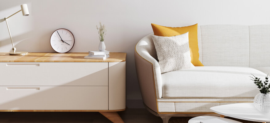
Responsive with multiple items + Controls and nav outside


<!-- Responsive with multiple items + Controls and nav outside -->
<div class="tns-carousel-wrapper tns-controls-outside tns-nav-outside">
  <div class="tns-carousel-inner" data-carousel-options='{"items": 3, "nav": false, "responsive": {"0":{"items":1},"500":{"items":2, "gutter": 18},"768":{"items":3, "gutter": 20}, "1100":{"gutter": 24}}}'>
    <img src="path-to-image" alt="Image">
    ...
  </div>
</div>
// Responsive with multiple items + Controls and nav outside
.tns-carousel-wrapper.tns-controls-outside.tns-nav-outside
.tns-carousel-inner(data-carousel-options='{"items": 3, "nav": false, "responsive": {"0":{"items":1},"500":{"items":2, "gutter": 18},"768":{"items":3, "gutter": 20}, "1100":{"gutter": 24}}}')
img(src="path-to-image", alt="Image")
...
Light controls
<!-- Light Carousel: Responsive with multiple items + Controls and nav outside -->
<div class="tns-carousel-wrapper tns-carousel-light tns-controls-outside tns-nav-outside">
  <div class="tns-carousel-inner" data-carousel-options='{"items": 3, "nav": false, "responsive": {"0":{"items":1},"500":{"items":2, "gutter": 18},"768":{"items":3, "gutter": 20}, "1100":{"gutter": 24}}}'>
    <img src="path-to-image" alt="Image">
    ...
  </div>
</div>
// Light Carousel: Responsive with multiple items + Controls and nav outside
.tns-carousel-wrapper.tns-carousel-light.tns-controls-outside.tns-nav-outside
.tns-carousel-inner(data-carousel-options='{"items": 3, "nav": false, "responsive": {"0":{"items":1},"500":{"items":2, "gutter": 18},"768":{"items":3, "gutter": 20}, "1100":{"gutter": 24}}}')
img(src="path-to-image", alt="Image")
...
Thumbnails nav + Slides count
<!-- Carousel with slides count -->
<div class="tns-carousel-wrapper">
  <div class="tns-slides-count text-light">
    <i class="fi-image fs-lg me-2"></i>
    <div class="ps-1">
      <span class="tns-current-slide fs-5 fw-bold"></span>
      <span class="fs-5 fw-bold">/</span>
      <span class="tns-total-slides fs-5 fw-bold"></span>
    </div>
  </div>
  <div class="tns-carousel-inner" data-carousel-options='{"navAsThumbnails": true, "navContainer": "#thumbnails", "gutter": 12, "responsive": {"0":{"controls": false},"500":{"controls": true}}}'>
    <div>
      <img class="rounded-3" src="path-to-preview-image1" alt="Image">
    </div>
    <div>
      <img class="rounded-3" src="path-to-preview-image2" alt="Image">
    </div>
    <div>
      <img class="rounded-3" src="path-to-preview-image3" alt="Image">
    </div>
    <div>
      <img class="rounded-3" src="path-to-preview-image4" alt="Image">
    </div>
    <div>
      <img class="rounded-3" src="path-to-preview-image5" alt="Image">
    </div>
  </div>
</div>

<!-- Thumbnails nav -->
<ul class="tns-thumbnails" id="thumbnails">
  <li class="tns-thumbnail">
    <img src="path-to-thumbnail-image1" alt="Thumbnail">
  </li>
  <li class="tns-thumbnail">
    <img src="path-to-thumbnail-image2" alt="Thumbnail">
  </li>
  <li class="tns-thumbnail">
    <img src="path-to-thumbnail-image3" alt="Thumbnail">
  </li>
  <li class="tns-thumbnail">
    <img src="path-to-thumbnail-image4" alt="Thumbnail">
  </li>
  <li class="tns-thumbnail">
    <img src="path-to-thumbnail-image5" alt="Thumbnail">
  </li>
</ul>
// Carousel with slides count
.tns-carousel-wrapper
.tns-slides-count.text-light
i.fi-image.fs-lg.me-2
.ps-1
span.tns-current-slide.fs-5.fw-bold
span.fs-5.fw-bold /
span.tns-total-slides.fs-5.fw-bold
.tns-carousel-inner(data-carousel-options='{"navAsThumbnails": true, "navContainer": "#thumbnails", "gutter": 12, "responsive": {"0":{"controls": false},"500":{"controls": true}}}')
div
img(src="path-to-preview-image1", alt="Image").rounded-3
div
img(src="path-to-preview-image2", alt="Image").rounded-3
div
img(src="path-to-preview-image3", alt="Image").rounded-3
div
img(src="path-to-preview-image4", alt="Image").rounded-3
div
img(src="path-to-preview-image5", alt="Image").rounded-3
// Thumbnails nav
ul(id="thumbnails").tns-thumbnails
li.tns-thumbnail
img(src="path-to-thumbnail-image1", alt="Thumbnail")
li.tns-thumbnail
img(src="path-to-thumbnail-image2", alt="Thumbnail")
li.tns-thumbnail
img(src="path-to-thumbnail-image3", alt="Thumbnail")
li.tns-thumbnail
img(src="path-to-thumbnail-image4", alt="Thumbnail")
li.tns-thumbnail
img(src="path-to-thumbnail-image5", alt="Thumbnail")
Inside card
Hover over me
Some quick example text to build on the card title and make up the bulk of the card's content within card's body.
Go somewhere<!-- Carousel inside card -->
<div class="card card-hover">
<div class="tns-carousel-wrapper card-img-top card-img-hover">
<span class="img-overlay"></span>
<div class="tns-carousel-inner">
<img src="path-to-image" alt="Image">
<img src="path-to-image" alt="Image">
</div>
</div>
<div class="card-body">
<h5 class="card-title">Hover over me</h5>
<p class="card-text fs-sm">Some quick example text to build on the card title and make up the bulk of the card's content within card's body.</p>
<a href="#" class="btn btn-sm btn-primary">Go somewhere</a>
</div>
</div>// Carousel inside card
.card.card-hover
.tns-carousel-wrapper.card-img-top.card-img-hover
span.img-overlay
.tns-carousel-inner
img(src="path-to-image", alt="Image")
img(src="path-to-image", alt="Image")
.card-body
h5.card-title Hover over me
p.card-text.fs-sm Some quick example text to build on the card title and make up the bulk of the card's content within card's body.
a(href="#").btn.btn-sm.btn-primary
| Go somewhere
Center slide
Simon Rock Concert
Holi Festival
Football Match
<!-- Center slide carousel -->
<div class="tns-carousel-wrapper tns-nav-outside tns-center">
  <div class="tns-carousel-inner" data-carousel-options='{"items": 1, "edgePadding": true, "responsive": {"0":{"controls": false, "gutter": 16},"500":{"controls": true, "gutter": 16}, "768": {"gutter": 24}}}'>

    <!-- Slide -->
    <div>
      <div class="card border-0 bg-size-cover pt-5" style="background-image: url(path-to-image);">
        <div class="d-none d-md-block" style="height: 13rem;"></div>
        <div class="card-body text-center text-md-start pt-4 pt-xl-0">
          <div class="d-md-flex justify-content-between align-items-end">
            <div class="me-2 mb-4 mb-md-0">
              <div class="d-flex justify-content-center justify-content-md-start text-light fs-sm mb-2">
                <div class="text-nowrap me-3">
                  <i class="fi-calendar-alt me-1 opacity-70"></i>
                  <span class="align-middle">Nov 15</span>
                </div>
                <div class="text-nowrap">
                  <i class="fi-clock me-1 opacity-70"></i>
                  <span class="align-middle">21:00</span>
                </div>
              </div>
              <h3 class="h5 text-light mb-0">Simon Rock Concert</h3>
            </div>
            <div class="btn-group">
              <a href="#" class="btn btn-primary rounded-pill rounded-end-0 px-3">Tickets from $50</a>
              <div className="position-relative border-start border-light zindex-5" style="margin-left: -1px"></div>
              <button type="button" class="btn btn-primary rounded-pill rounded-start-0 px-3">
                <i class="fi-heart"></i>
              </button>
            </div>
          </div>
        </div>
      </div>
    </div>

    <!-- Add as many slides as you need -->
    ...
  </div>
</div>
// Center slide carousel
.tns-carousel-wrapper.tns-nav-outside.tns-center
.tns-carousel-inner(data-carousel-options='{"items": 1, "edgePadding": true, "responsive": {"0":{"controls": false, "gutter": 16},"500":{"controls": true, "gutter": 16}, "768": {"gutter": 24}}}')
// Slide
div
.card.border-0.bg-size-cover.pt-5(style="background-image: url(path-to-image);")
.d-none.d-md-block(style="height: 13rem;")
.card-body.text-center.text-md-start.pt-4.pt-xl-0
.d-md-flex.justify-content-between.align-items-end
div.me-2.mb-4.mb-md-0
.d-flex.justify-content-center.justify-content-md-start.text-light.fs-sm.mb-2
.text-nowrap.me-3
i.fi-calendar-alt.me-1.opacity-70
span.align-middle Nov 15
.text-nowrap
i.fi-clock.me-1.opacity-70
span.align-middle 21:00
h3.h5.text-light.mb-0 Simon Rock Concert
.btn-group
a(href="#").btn.btn-primary.rounded-pill.rounded-end-0.px-3
| Tickets from $50
.position-relative.border-start.border-light.zindex-5(style="margin-left: -1px;")
button(type="button").btn.btn-primary.rounded-pill.rounded-start-0.px-3
i.fi-heart
// Add as many slides as you need
...
Content carousel with external controls
Lorem ipsum dolor sit amet, consectetur adipiscing elit, sed do eiusmod tempor incididunt ut labore et dolore magna aliqua. Ut enim ad minim veniam, quis nostrud exercitation ullamco laboris nisi ut aliquip ex ea commodo consequat.
Lorem ipsum dolor sit amet, consectetur adipiscing elit, sed do eiusmod tempor incididunt ut labore et dolore magna aliqua. Ut enim ad minim veniam, quis nostrud exercitation ullamco laboris nisi ut aliquip ex ea commodo consequat.
<!-- Carouel linked to external controls -->
<div class="tns-carousel-wrapper">
  <div class="tns-carousel-inner" data-carousel-options='{"controlsContainer": "#external-controls", "nav": false, "gutter": 20}'>

    <!-- Item -->
    <div class="text-center ps-1">
      <blockquote class="blockquote">
        <p>Lorem ipsum dolor sit amet, consectetur adipiscing elit, sed do eiusmod tempor incididunt ut labore et dolore magna aliqua. Ut enim ad minim veniam, quis nostrud exercitation ullamco laboris nisi ut aliquip ex ea commodo consequat.</p>
        <footer class="blockquote-footer">Someone famous in <cite title="Source Title">Source Title</cite></footer>
      </blockquote>
    </div>

    <!-- Add as many items as you need -->
    ...
  </div>
</div>

<!-- External controls (prev/next buttons) -->
<div class="tns-carousel-controls justify-content-center" id="external-controls">
  <button type="button" class="mx-2">
    <i class="fi-chevron-left"></i>
  </button>
  <button type="button" class="mx-2">
    <i class="fi-chevron-right"></i>
  </button>
</div>
// Carouel linked to external controls
.tns-carousel-wrapper
.tns-carousel-inner(data-carousel-options='{"controlsContainer": "#external-controls", "nav": false, "gutter": 20}')
// Item
.text-center.ps-1
blockquote.blockquote
p Lorem ipsum dolor sit amet, consectetur adipiscing elit, sed do eiusmod tempor incididunt ut labore et dolore magna aliqua. Ut enim ad minim veniam, quis nostrud exercitation ullamco laboris nisi ut aliquip ex ea commodo consequat.
footer.blockquote-footer Someone famous in <cite title="Source Title">Source Title</cite>
// Add as many items as you need
...
// External controls (prev/next buttons)
#external-controls.tns-carousel-controls.justify-content-center
button(type="button").mx-2
i.fi-chevron-left
button(type="button").mx-2
i.fi-chevron-right